

Print Graphics
Paper marketing presents an interesting problem. One must be able to grab and maintain a viewer’s attention amidst an enormous amount of competing content. Then it has to deliver a fair number of memorable details quickly enough that it will lead a potential customer to take action. This is no small task. Digital media presents some of the same difficulties, but offers a wider array of tools to the design team to make this happen. I love meeting these challenges.
*ctrl+ / cmd+click to open an image in a new tab for more detail

These first three examples show what can be done with a branding package. They are all performances by FEARless Productions where each maintains its own character while remaining true to the company's branding profile.
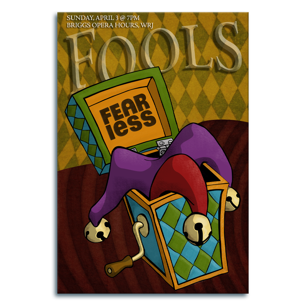
In this second FEARless Productions example, the logo is still quite prominent inside the box lid. But rather than the photocomposite, we have a stylized comic jack in the box, which has broken while trying to open - how embarrasing.
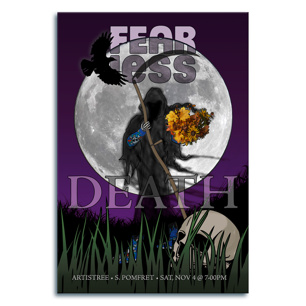
In this FEARless Productions example we combine photo composition with comic style. The Grim Reaper wearing the pajamas beneath her robes is a chracter who showed up in the annual October show themed upon the Fear of Death.
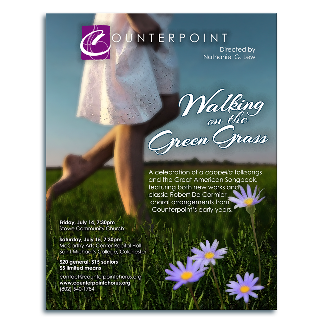
A quick composite poster done for a company I often work with. I worked within their staff designer's style, maintained the company's branding, and put my own touch on it as well. The image is a stylized photocomposite made of 5 or 6 images.
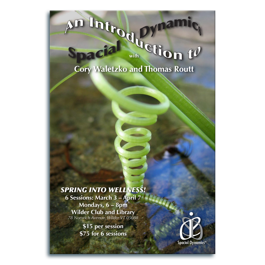
This postcard was designed to advertise a program created by Spacial Dynamics®. It uses their fonts and logo (bottom right). They liked the lemniscate title text so much that they asked for permission to use it on a variety of pieces.
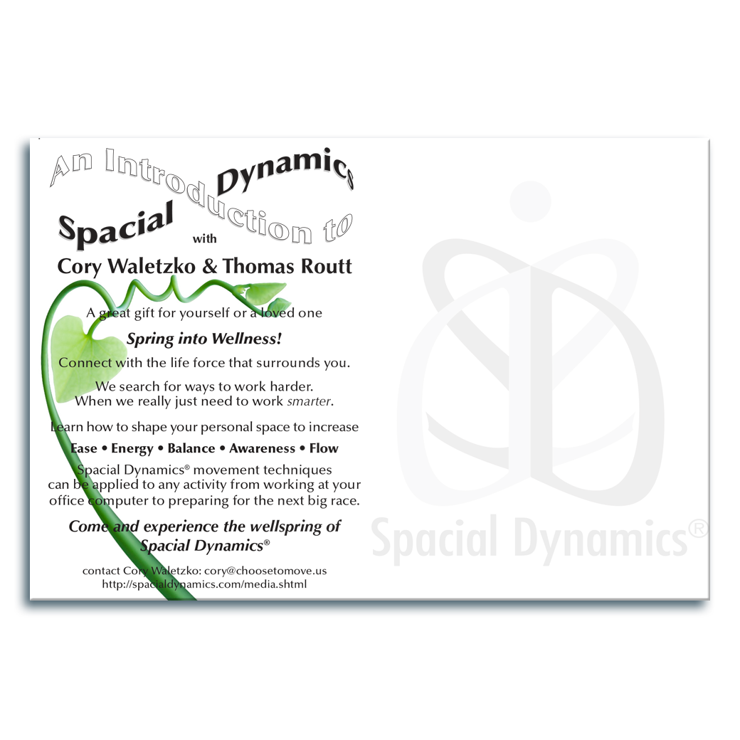
Every once in a while, one has the time to do a little something extra for a client. I found this spiraling spring shoot to echo the image on the front of the card. The client loved it.

When this post card was created, the client had no useable images. The classroom behind the child in this shot was in such disarray that I replaced the background with a close-up of a painting that was hanging on the wall in the same room.

This Parish Players production needed a simple and stark poster that echoed the cold of the winter performance, but still felt inviting and intriguing. The two trees represented the two co-producers. The image is a composite of three different pieces.

Because this piece was presented entirely in black and white, I was able to add the tracks to the back of the card, and have it make it's way through the USPS mailing scanners.
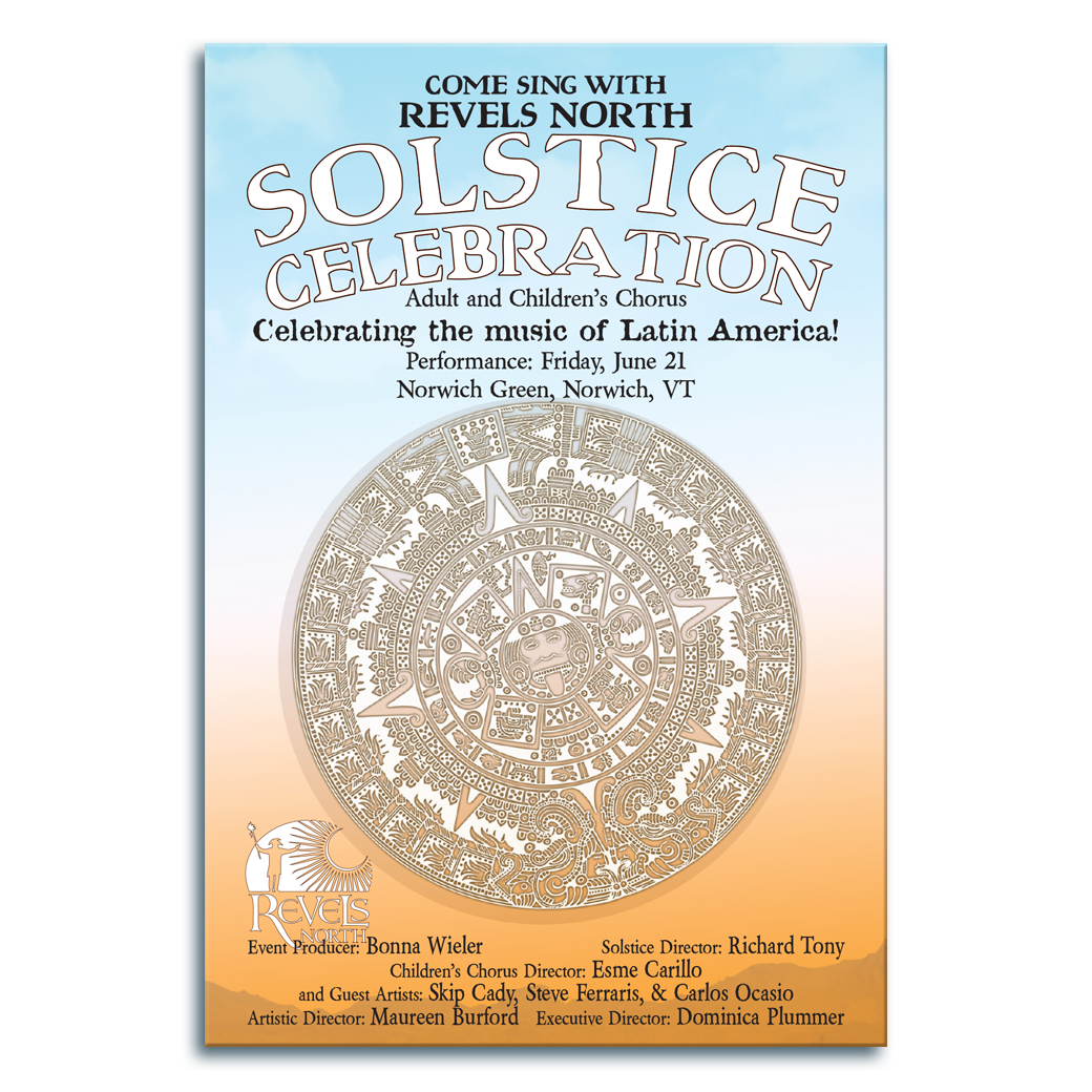
This production of Revels North® was a sprawling, full-day affair with singing and dancing from morning to evening, with games and vendors surrounding the Norwich Green. I chose to offer them a simple, yet detailed image of the Aztec Sun Disk.
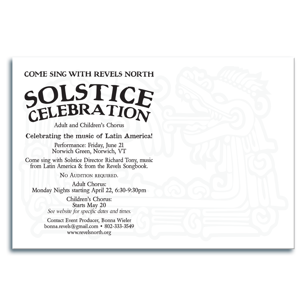
The Children's play that was a part of the event told the story of a Dragon that was having difficulty baking bread... she would always burn it. So, I found the pictogram of a mexican serpent/dragon to add a subtle decoration to the back of this post card.
The final 4 pieces are for a long-standing client. I maintained their branding profile through more than a decade's worth of marketing materials. Each title is a hand-designed logo. The images are composites of anywhere between 4 and 20 images.
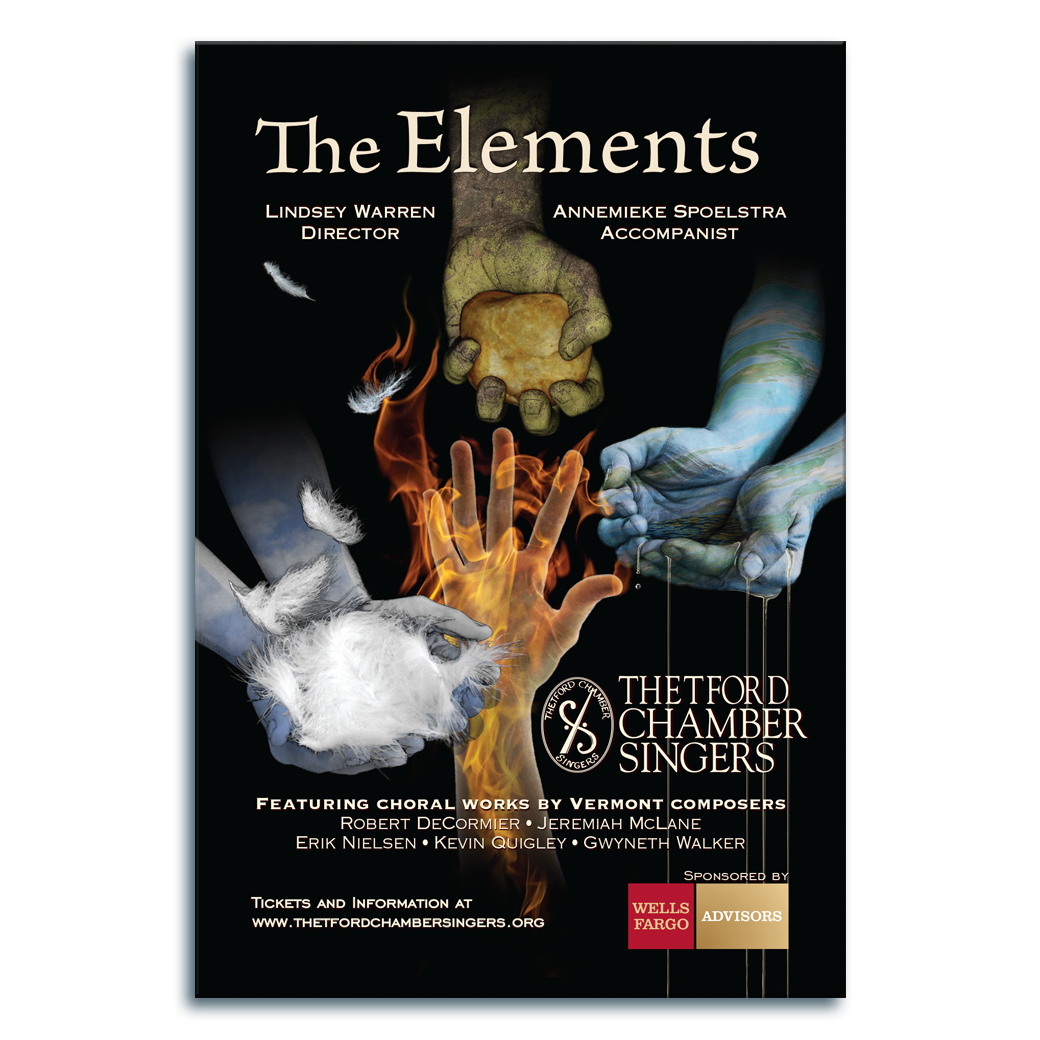
This poster uses a composite of 4 people's hands shot in my kitchen, and at least 12 other photographic and hand-drawn elements.

A photo composite of 6 different shots created way before Asobe's nueral filter's abilities to make realistic skies. The large overhanging crescent embraces both the waning moon and the growing tree.
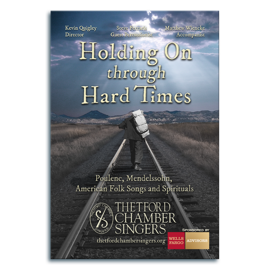
A composite of 7 images places the vintage sojourner onto a set of tracks that traveled through a very different landscape under a vastly different sky. If I recall, removing the distant city and replacing it with the far off mountains was quite the challenge.
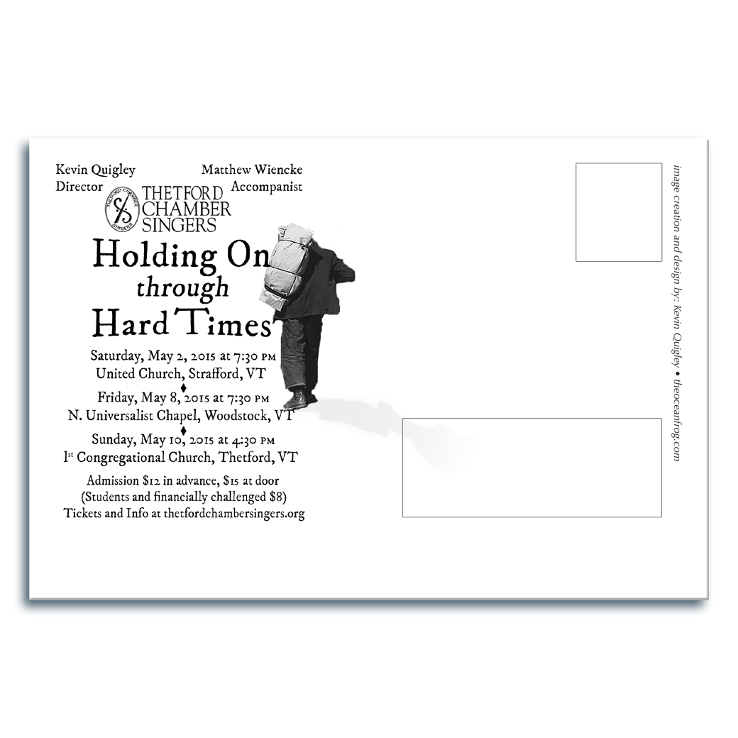
I took the wayfarer found on the front and placed him next to the title on the back of the card.