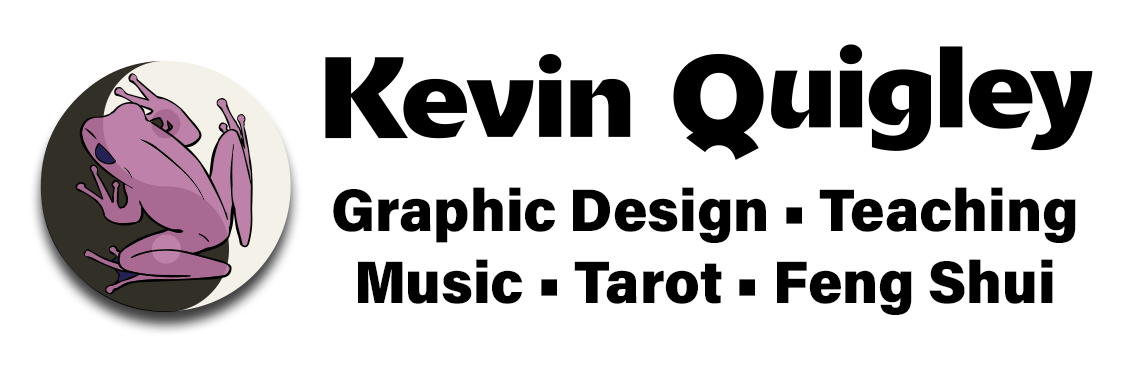
Logos and Branding
My logo design philosophy begins with the idea of “keep it simple.” Whenever possible, I like to work without color. This increases printing options and can often reduce costs. Color can then be added in situ according to a user’s branding profile. A second preference is to ensure easy recognition and legibility at a distance. A logo does little good if a viewer doesn’t know what it is: on a sign across the street, or on a passing bus, or on a blimp way overhead. Once these two qualities are satisfied, we can then begin to play with shape, composition, ingenuity, and meaning.
*ctrl+ / cmd+click to open an image in a new tab for more detail
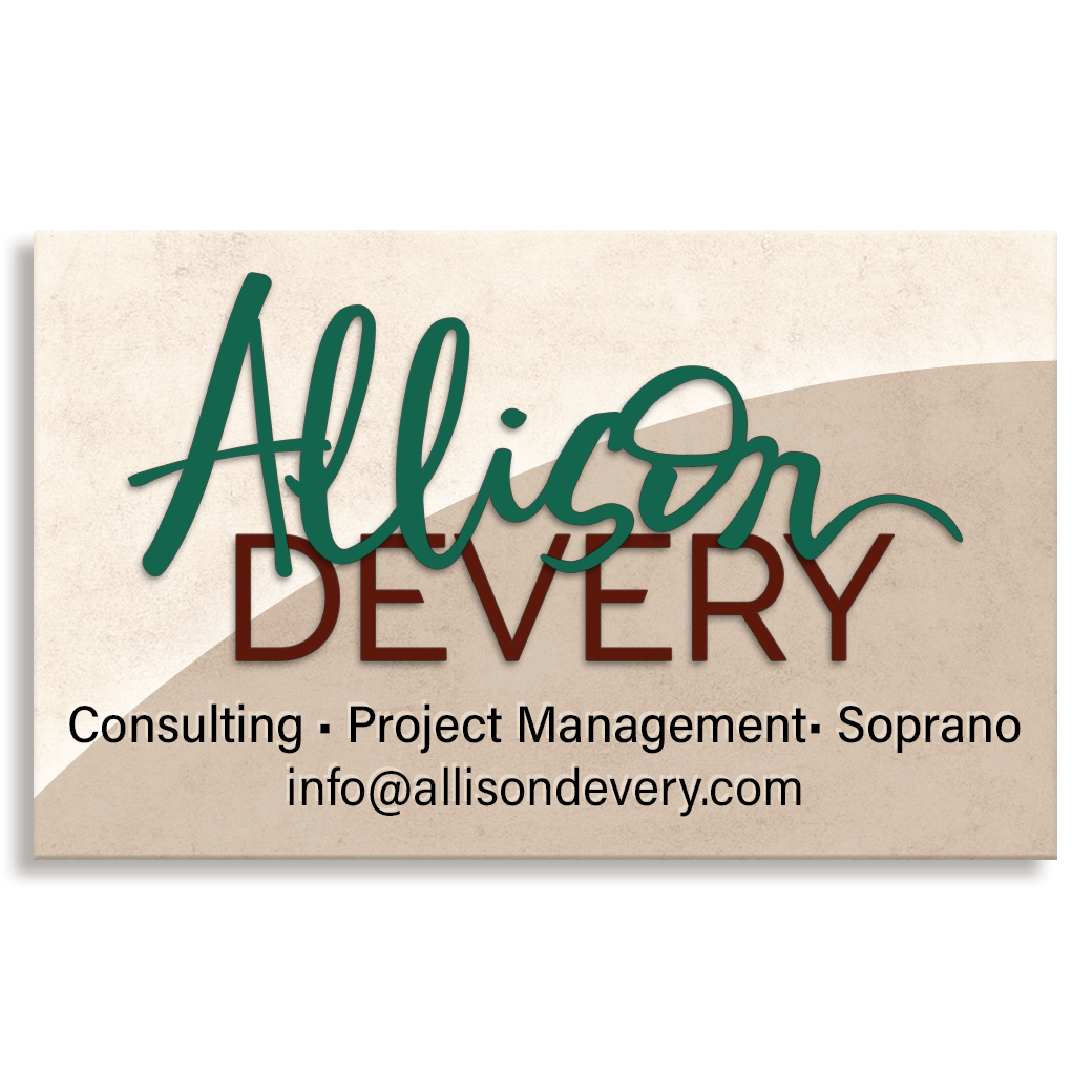
A self-employed professional and peforming artist needed a logo that combined both of these words: the free-flowing artiste and the capable office manager.
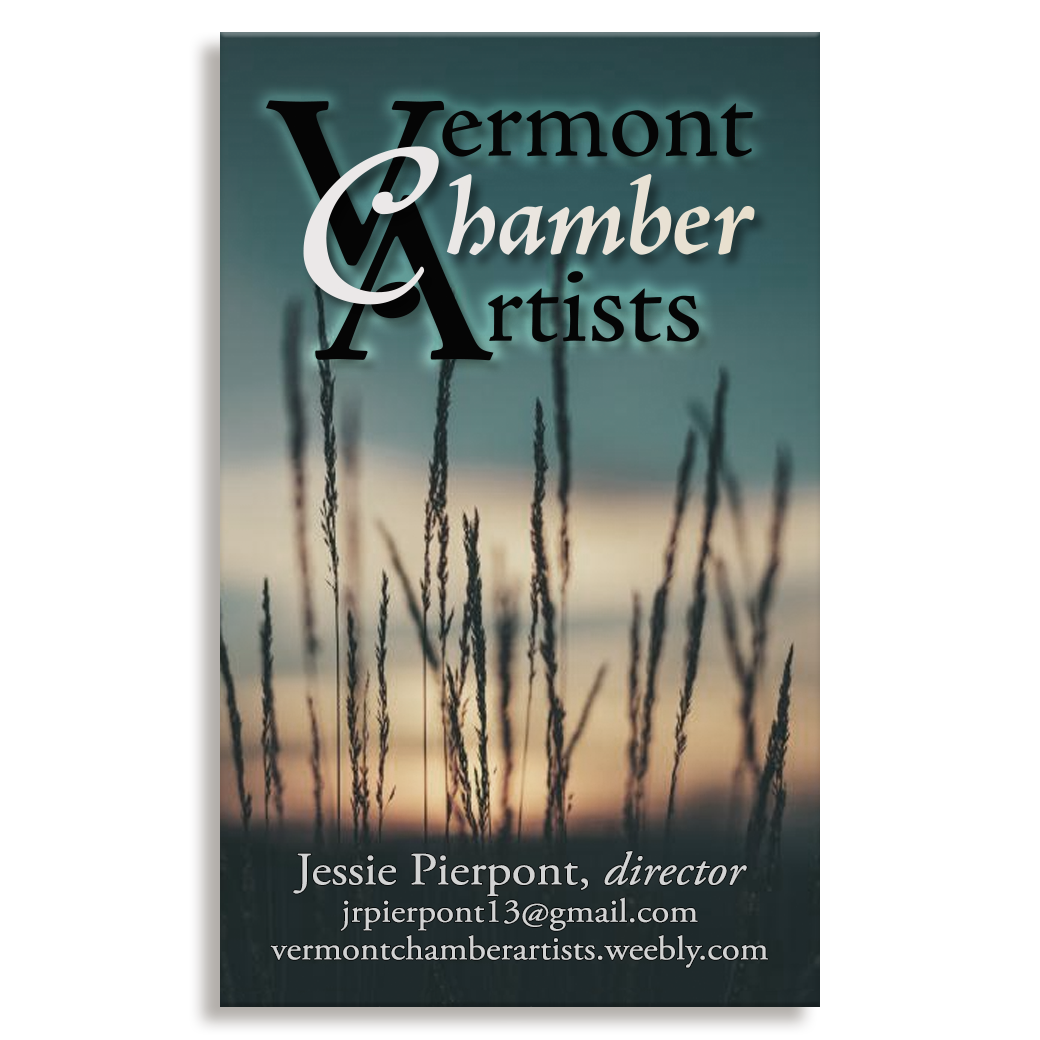
A choral director in the northern part of the state needed a classic logo for starting a new organization to work as an umbrella over several ensembles.
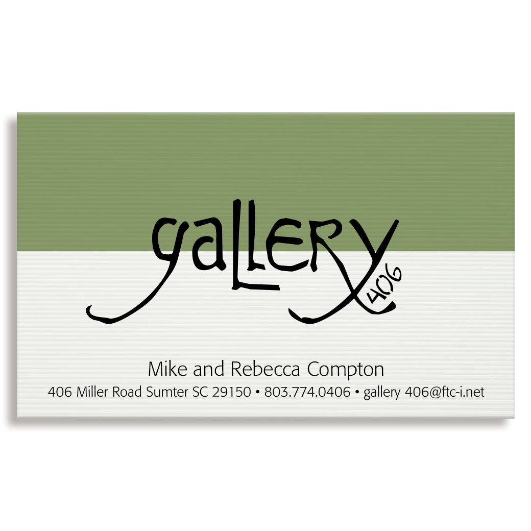
A new Art Gallery in South Carolina required a logo that could be laser cut out of an inch-thick sheet of aluminum for their street-side sign.
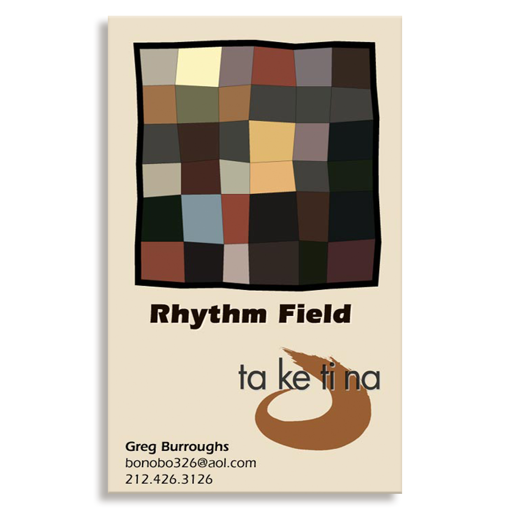
A percussionist and drum teacher needed branding and a logo for his business. The square above, inspired by the paintings of Paul Klee, would build itself randomly on the cover of his website with each visit.
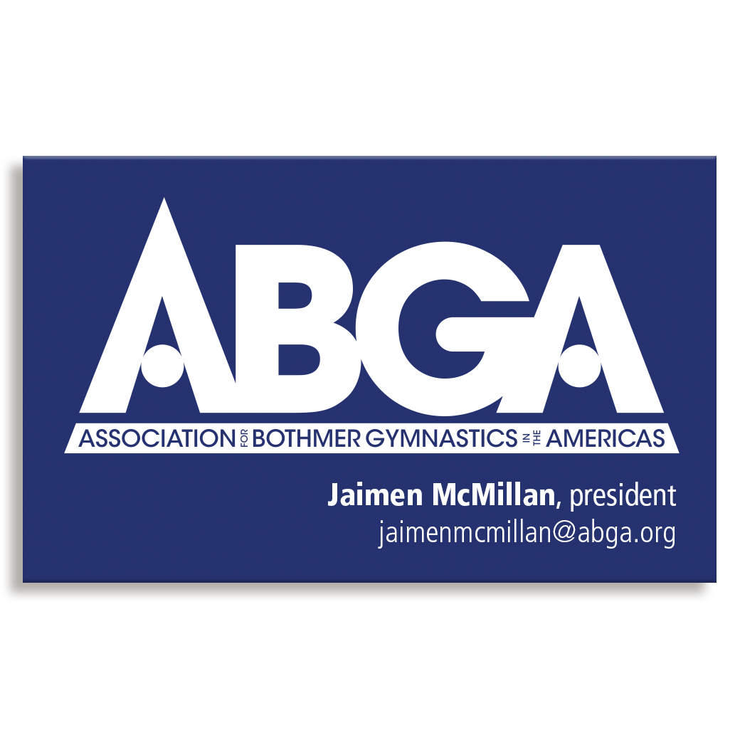
A new organization designed to the various Bothmer Gymnastics teachers and school in the Western Hemisphere together. The logo is strong and connected. The opening and closing "A"s build a pyramid shape to indicate the hierarchichal structure of the organization and the circles within each "A" are representations of shapes used with many of its exercises.
A lower Manhattan jazz quintet required a simple logo to represent itself for recordings and performances. The clean, but primitive approach echoes it's improvisational approach - each piece of music was "drawn" differently at each performance.
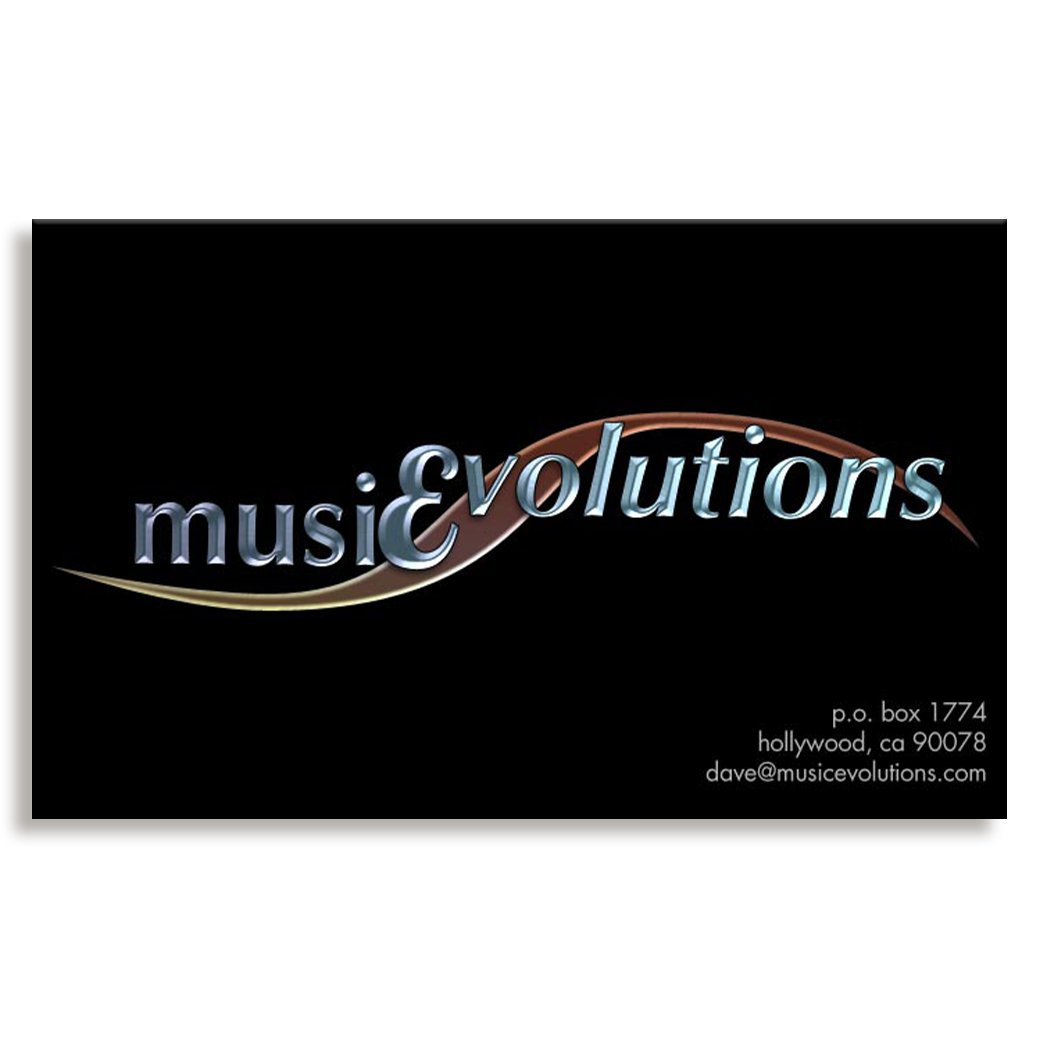
A Los Angeles recording studio enjoyed the word puzzle that combines the letters "c" and "E". The curve represents a sound wave and assists the eye in following the differentiated base lines of the text.
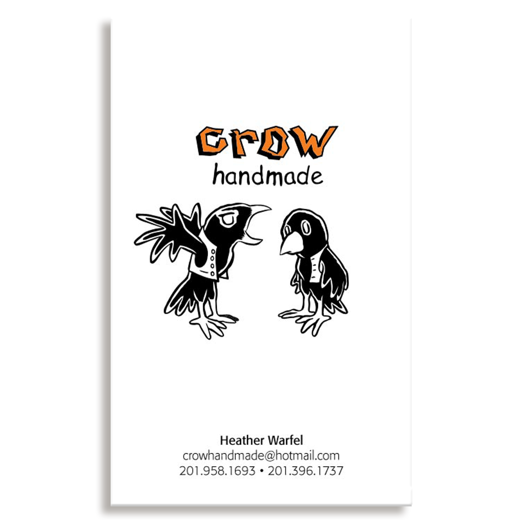
A Jersey City textile artist. Her work has a very graphic and cartoony style. She requested the two crows and their relationship, specifically.
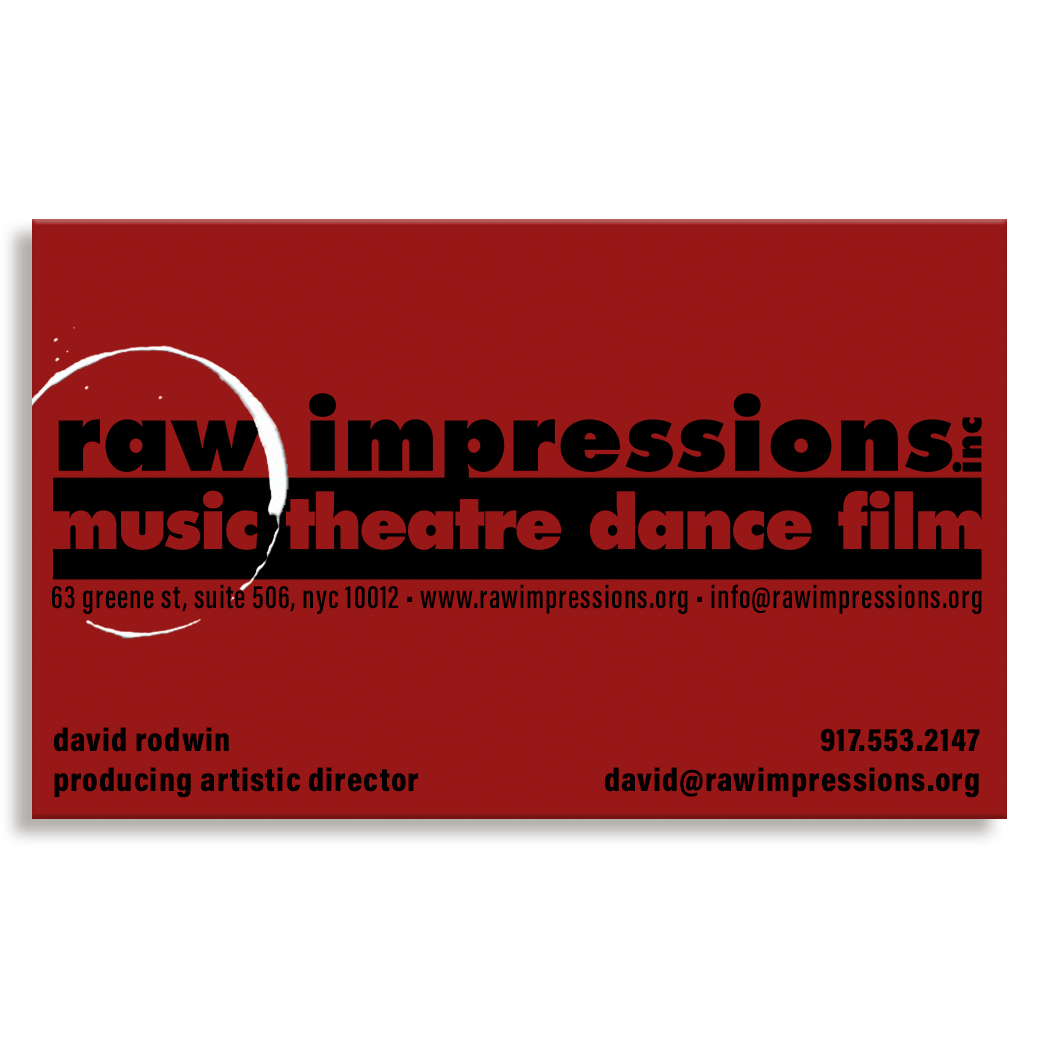
A New York City performing arts production company that specializes in creating complete productions in a matter of days. We used the "coffee" ring to indicate the speed of their development style and the negative space in the underlining bar to allow participating artists to feel that there was plenty of space for their input and creativity.
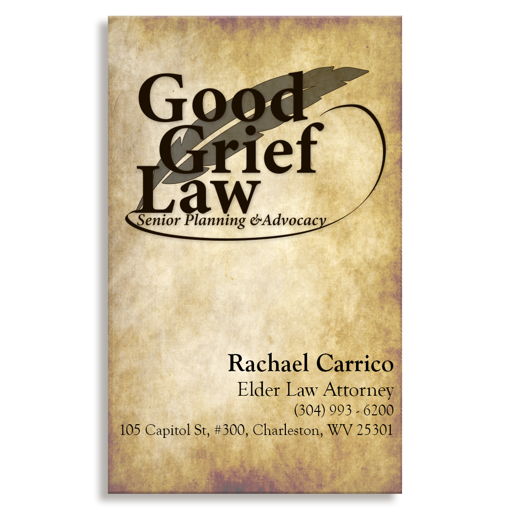
A West Virginia lawyer needed a classic, easily-readable logo with a slight flair. She requested the quill pen and flourished stroke, to communicate to her clients that she would prep and submit their needed documents quickly and cleanly.
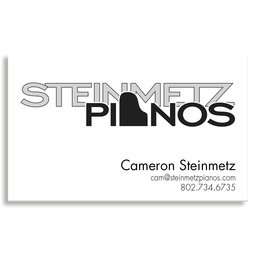
A Burlington, VT piano repair technician needed some branding for his new business. In development we must have gone through more than a dozen options, but the replacement of the central letter A has done the trick. His client list is growing fast.
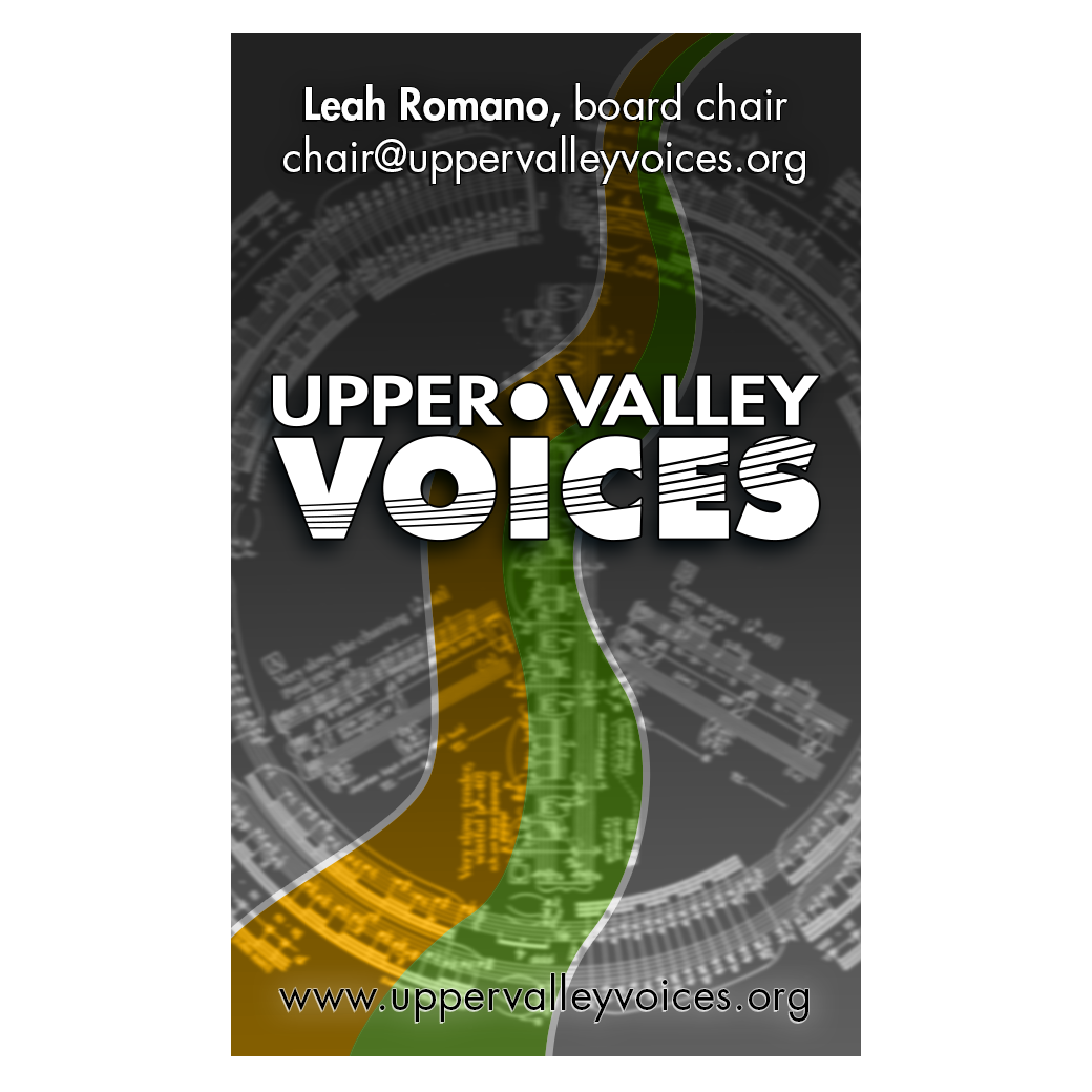
A new chorus in the Upper Valley required a logo that stepped out of the stodgy marketing pieces of similar ensembles. This one incorporates a rising musical staff and a road that leads into the future.
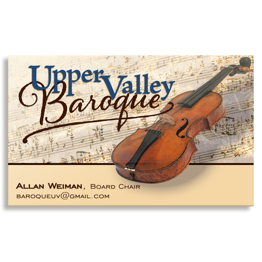
A Dartmouth-connected ensemble dedicated to Baroque era music needed some branding that both connected it to a long-held traditional past but still managed to be full of energy and life.
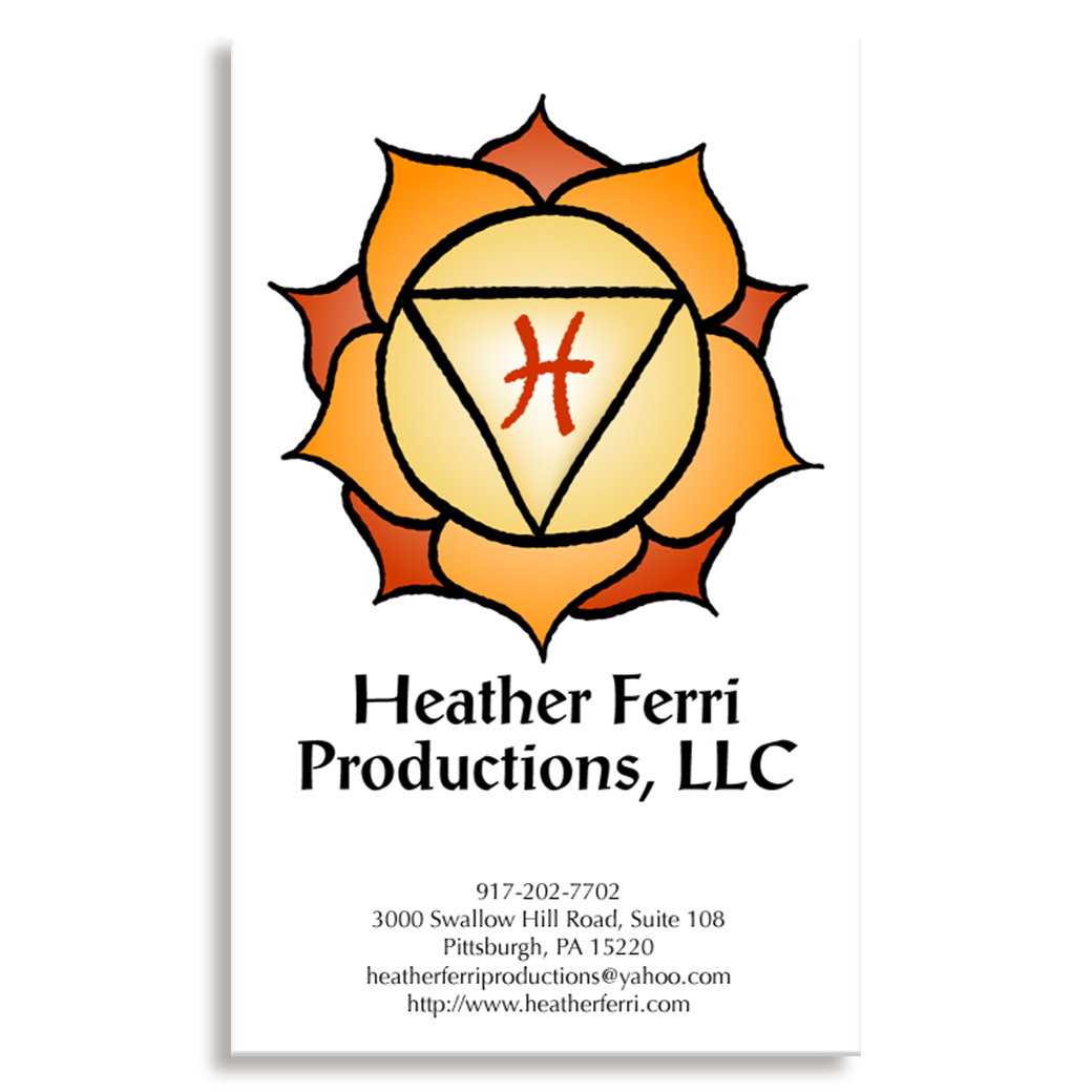
A Pittsburgh yoga teacher and healer wanted a stable, yet inviting logo. We chose to employ a relatively traditional lotus illustration that has been used in her spiritual school for centuries, but colored it to feel like a burst of sunshine.
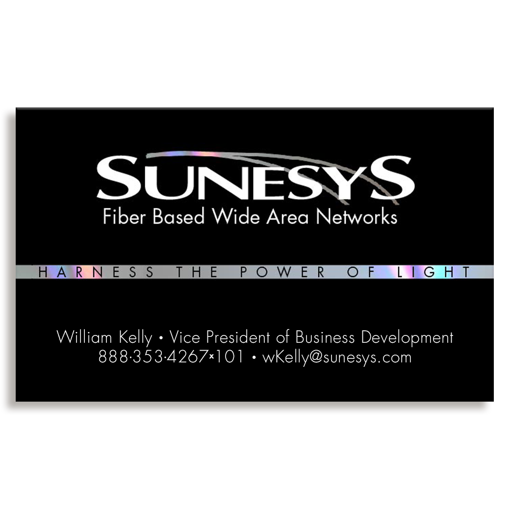
A D.C.-based fiber optic company required some eye-catching branding. We used a striking matte black card with a strip of fiber optic tape across the center of the card.